I was lucky to grow up in a creative household. My dad has been crafting form from material for as long as I can remember. It was a joy of mine to be able to collaborate in a small way by designing and building a website to share some of his work. This was my first lockdown project which I treated as an opportunity to learn how to work with Jekyll
A snippet of content from the site’s landing page
Why now?
Traditional sculptors typically don’t have much of a contemporary web-presence, instead they often rely more on old-school methods of reaching their audience; through exhibitions and word of mouth. Given the rapid closure of galleries and exhibition spaces, I wanted to give my dad the opportunity to connect his work with people through a beautifully designed website. I also saw this as an opportunity to reach a younger audience by creating something traditional that felt contemporary in presentation.
Giving content the centre stage
The beauty of a project like this is that it’s ultimately about the content. The sculpture is bold and powerful in aesthetic, comfortably speaking for itself. Subsequently, the needs weren’t complicated. The site had to display work and give some information about the artist. There are fewer than 10 pieces chosen for display, so there was plenty of room to place emphasis on each individual piece.
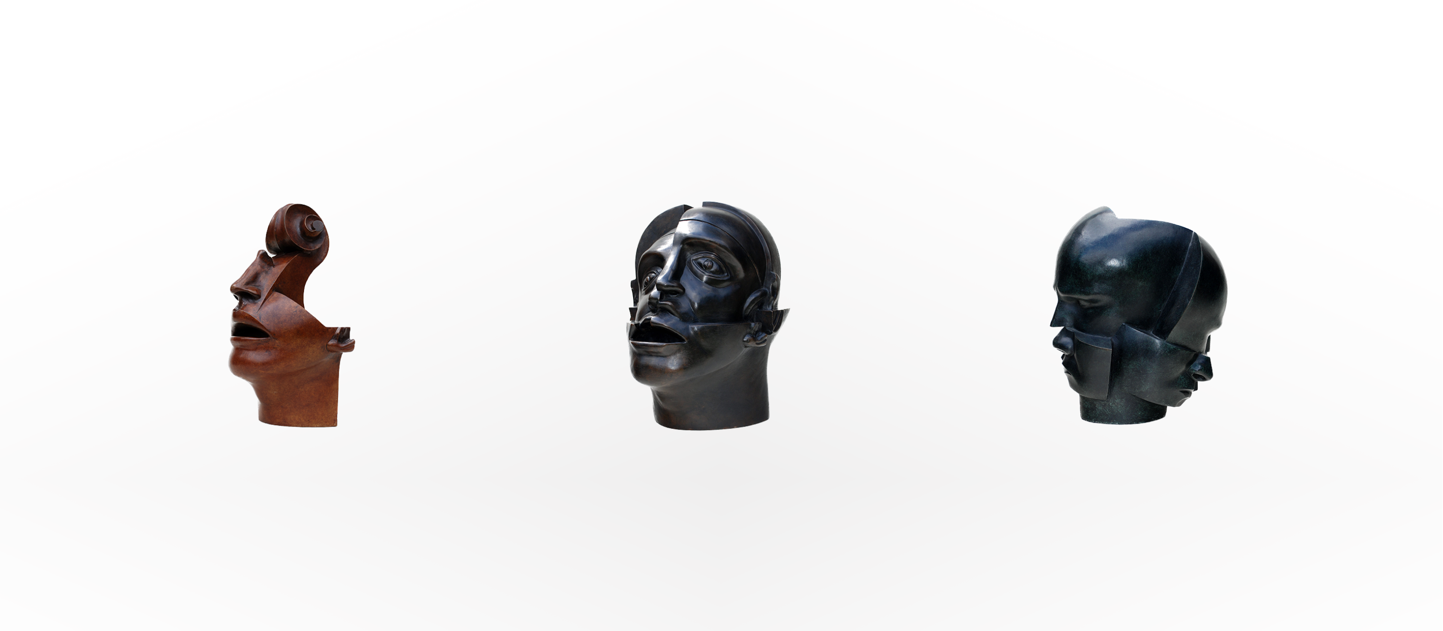
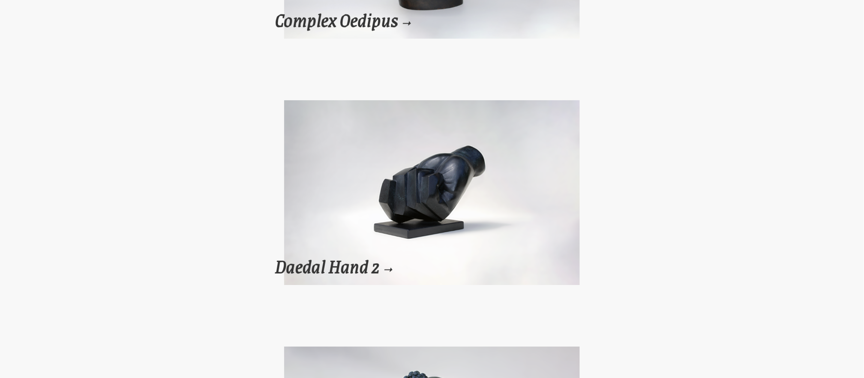
3 sculptures from the site; The Key to My Soul, Complex Oedipus and Indecisive.
The structure of the site would support one layer of depth: the user lands on the site and either selects a sculpture to view, or learns more about the artist.
This content could comfortably fit on one page, but a sense of separation would make the site scale better if more work is added in future, is far better for SEO (search engine optimisation) and would allow people to link to direct pages as opposed to anchor points.
An appropriately lightweight tech stack
I’m a designer, not a developer, but since it was peak COVID-times I wanted to dip my toes a little more into web tooling. I decided to build this site using Jekyll for a few reasons:
- I wanted to learn how to use Jekyll for my own projects and this website was very simple (with regards to structure) so was a great candidate to learn with
- Jekyll takes an input (markdown files) and renders it as a static HTML site. Given how little content was needed, this was a beautifully lightweight way of building pages
- Thanks to Markdown I could build a workflow where content could be published and updated from an iPad using a notes app and a Shortcut. It would perhaps be over-engineered given the needs (especially given the likely infrequency of updates), but again, a great opportunity to learn with something simple.
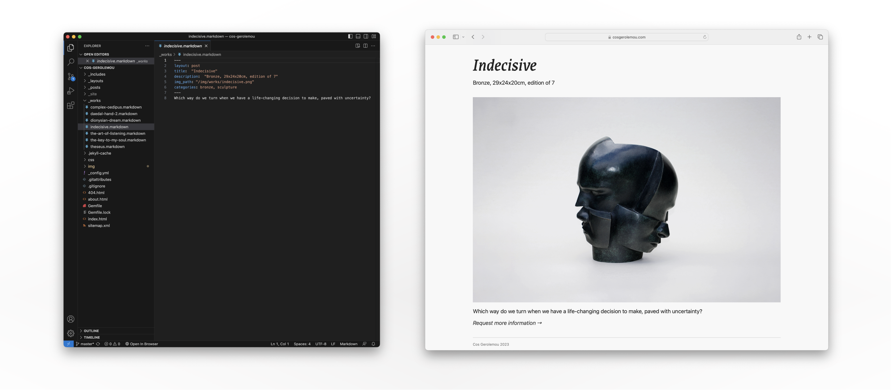
The lightweight CMS (a markdown document) alongside the compiled page for a piece of work
A minimal but complimentary visual language
Design trends come and go. I wanted to design something that looked contemporary, but also wanted to avoid overly-dating the aesthetic to the extent that I’d have to update it often. It felt appropriate to limit the use of bold visual elements to only a few in order to let the work speak for itself. The two elements I chose to play with were typography and layering.
Typography
Grenze Regular Italic: Grenze is a blackletter/roman font that a character which suited the work. While Cos’ sculpture is inspired by Greek mythology, Grenze felt a good fit while also having the (significant) benefit of being a free web-based font. It holds up to the harsh and intentional lines commonly used in the work.
San Francisco Pro: Unless there’s a stylistic need, I like to rely on system styles for pairing. This keeps things feeling relatively native while also bringing performance benefits.
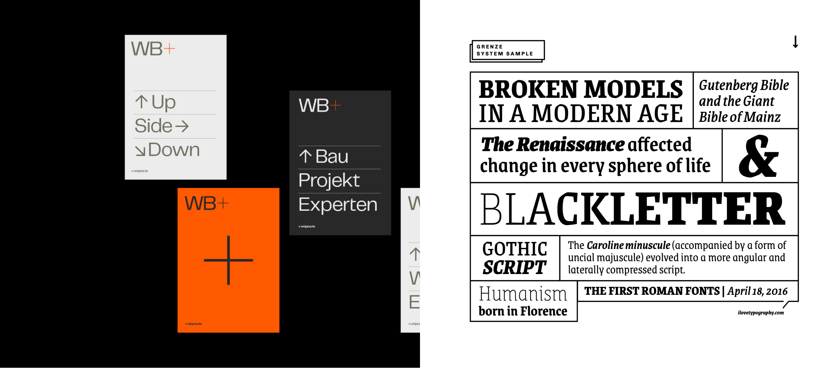
Some visual reference material, including the type spec for Grenze
Layering
The intention of using layering for key content was to give an architectural, structural feel, not to build a sense of layered materials (hence the lack of shadow). Artist labels in galleries are always very carefully contained and we liked the idea of breaking that model entirely with the display on this site.
Beyond the title cards, the site was so lightweight on content that we felt comfortable pushing the layering across all key pages, having content dynamically scroll over both the landing and about page. Aside from the visual metaphor, the sense of permanence from the static key content subtly mimics the weight of the materials used; marble, bronze and wood. Content begins off-screen to encourage the users to scroll.
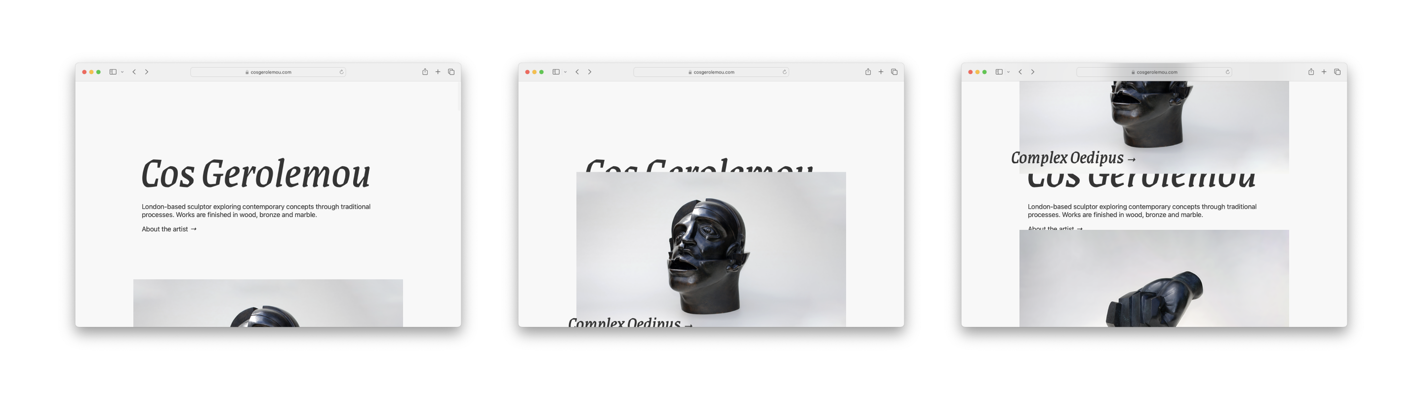
The landing page for cosgerolemou.com, showing the playful use of layering in the visual language
Building something contextually relevant
While this was largely a creative endeavour (giving equal weight to both expression and function), there were a few intentional moments where we made decisions based on user-context. Two examples include:
- Building the site to be fully responsive. The content obviously looks best on large screens, but the site is likely to be emailed, texted or searched for on phones. It felt like a win to be intentional about the display here and step back a few of the creative decisions in favour of a better mobile experience
- Some early feedback from users was that they wanted to learn more. I quickly learned that it wasn’t clear that users could click into the sculptures to learn more. I had gone too far down the expressive path and not made it obvious that content was interactive. This feedback resulted in the inclusion of the trailing arrows to encourage interaction, resoundingly solving the issue
Feel free to take a look at the live site. Please reach out if you’d like to learn more about Cos’ work.