Hermes is a personalized heads-up display for browsers, designed to my own personal spec. I chose to display two RSS news feeds, a feed of photography inspiration and some contextual data + shortcuts. I built Hermes as a passion project and haven’t launched it publicly. I chose the name as a nod to my heritage—Hermes is messenger to the Gods in ancient Greek mythology
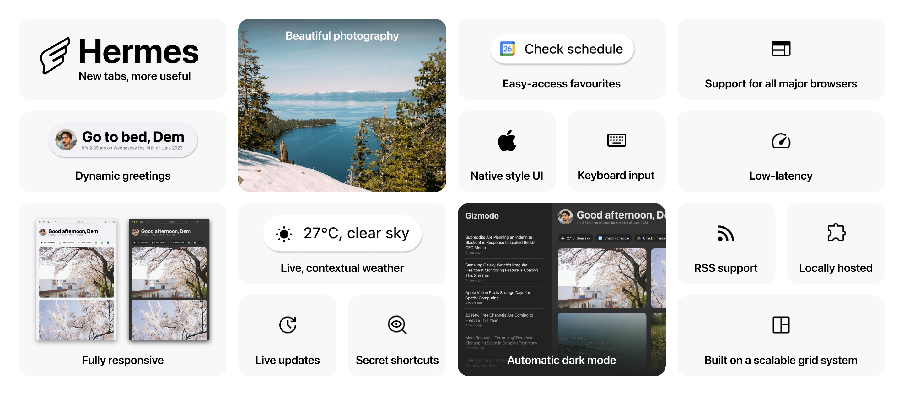
An overview of Hermes’ key features including dynamic greetings, fully responsive design, beautiful photography, live and contextual weather, live updates, secret shortcuts, easy-access favourites, native style UI, keyboard input, automatic dark mode, support for all major browsers, low-latency performance, RSS support, locally hosted as a browser extension and being built on a scalable grid system
The initial conditions for starting Hermes
It had been a while since my last personal project and there were a few itches I had to scratch that nicely intersected, leading to me getting started with Hermes
- I’d been frustrated with the adverts and cluttered UI in the feed reader I had been using
- I’d been looking for an excuse to dip my toes into the world of using large language models (LLM) as a consumer
- I’d been working on the same product for a while and wanted to get stuck into some more visual design. In particular, I had been keen to dip my toes in Apple’s design guidelines as I had spent quite some time working with Google Material already
The project took around 2 weeks from inception to launch, but has been a constant playground for me to tinker with, adding new features and iterating based on my usage
How would this look if it were shipped as part of macOS?
For years I’ve been building products to be respectful of platform design guidelines. This can help build trust and confidence, but beyond isolated experiences I appreciate native-feeling products as it helps platforms feel more seamless as opposed to a series of disjointed experiences.
It’s been years since I designed anything for Apple’s ecosystem yet I use macOS, iOS and watchOS daily. My familiarity with the unified design language meant I was keen to jump straight into using it for Hermes.
Hermes is essentially a web-app meaning it can be used on any platform or browser, however I wanted to build something purely based on my own needs for once. Setting this boundary for the project helped me deprioritise things like font rendering across other operating systems in favour of spending more time on design details that I’d appreciate in my own usage.
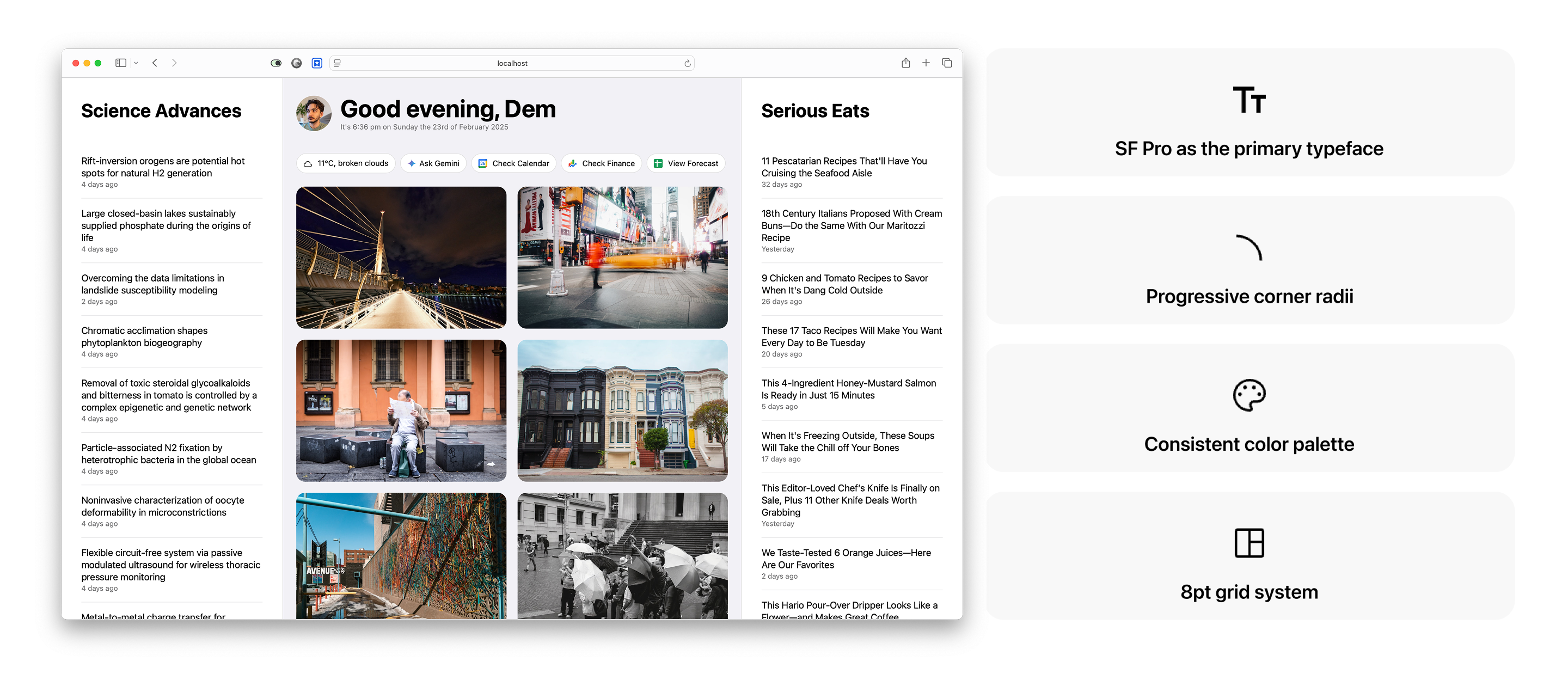
Basic styles aligned to Apple’s design language, including the use of SF Pro as the primary font, progressive corner radii, a color palette consistent with Apple’s and an 8pt grid system. I should call out that I’m rarely not horrified by the inhumanity captured near daily in the headlines
Augmenting my technical abilities in favour of pace
I’m a designer by trade but I love hacking things together to make things work. I’ve worked with code for over a decade but don’t feel like I could call myself an engineer. I’ve always learned just enough to get the job done and no more. It’s served me well since the majority of these projects have been exploratory or self-initiated. By way of an example, I’ve:
- Used basic programming to create an interactive installation using Microsoft’s Kinect for my final major project in my degree
- Created an interactive charting prototyping using CoffeeScript to improve the quality of our User Research in response to participants stating that static charts are difficult to imagine as interactive
- Built countless websites using Stack Overflow, HTML, CSS, JavaScript, Jekyll and for some cruel reason, PHP
In short, I was confident that with enough time I’d be able to build whatever I wanted. The emphasis here is on ‘enough time’. I didn’t want this to drag on and become a chore. LLMs had recently become available for consumers to use so my attitude was that I’d code as much as I could, but when I got stuck I’d consult an LLM-based chatbot. A few specific examples of what I consulted my AI co-pilot include:
- Reviewing my script to update the greeting based on time of day
- Reviewing my script for replacing the weather icons from OpenWeather’s API with a set I preferred
- Riffing on possible technical approaches for specific tasks (e.g. identifying the most efficient way to surface RSS)
- Bugfixing my implementation of a script that would support dynamic time (e.g. X hours ago if an article is from today, 1d ago if an article is from yesterday, etc)
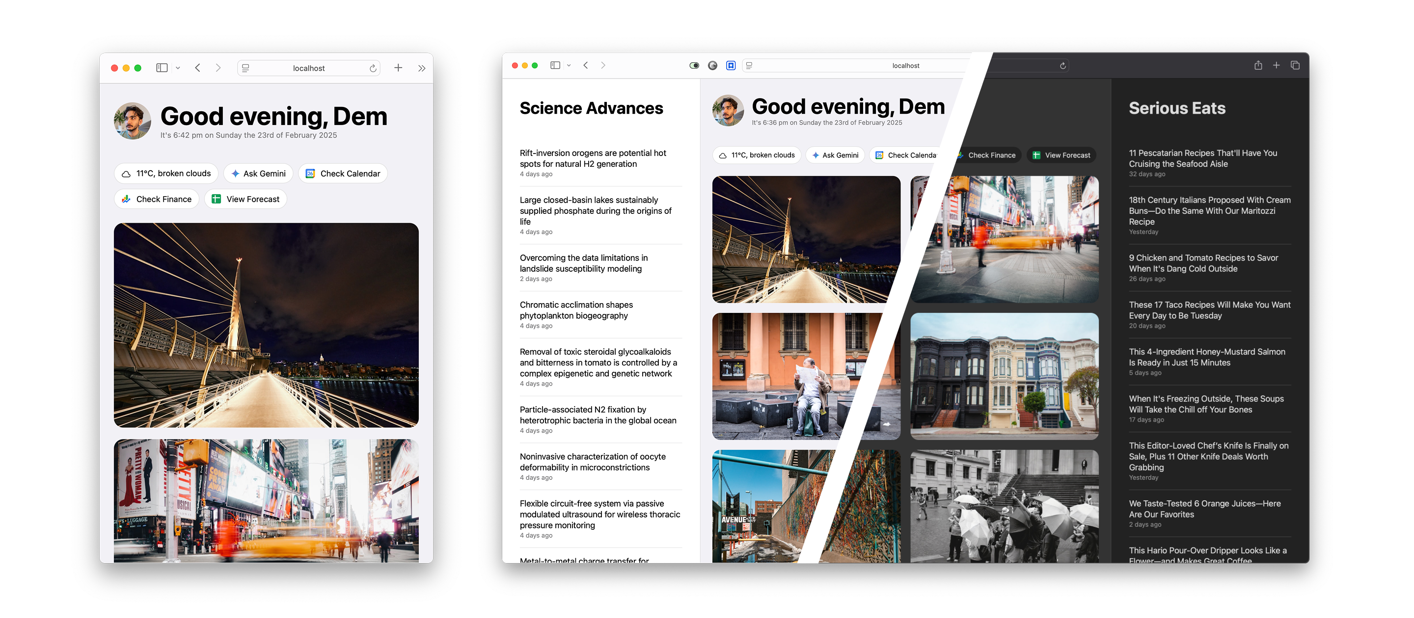
The small-window experience for Hermes, alongside light and dark mode
Sweating the details
I mentioned that this was a passion project with the primary user being myself. This meant I could prioritize tiny details that I wanted to, not more significant requirements that would drive impact if the product was launched at scale. A few examples here include:
- Hiding divider lines during
:hoverstates without the 1pt bump in positioning - Hiding stroke from interactive chips during
:hoverstates to make shadow look more natural - Creating a bespoke dark mode theme that felt natural as opposed to simply inverting the color palette
- Getting fussy with
overscrollbehavior - Ensuring everything refreshed at an appropriate interval (e.g. the timestamp would need to be frequen, the weather could be infrequent, as could articles) to make things feel fresh without being wasteful
- Creating a great responsive experience. I use my chosen browser in full-screen all the time so will likely never see the small-window experience, however once every other month when I do see it, I want to know that it’s optimised…
Not only am I proud of the outcome as a standalone project, but it’s been incredibly useful for me, replacing the default new tab experience I had before. How many of you can say that your new tab page will tel you it’s time to go to bed?!
Thanks to Daouna Jeong for the icon.